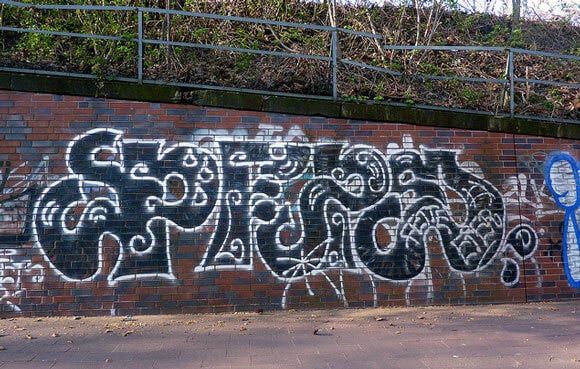
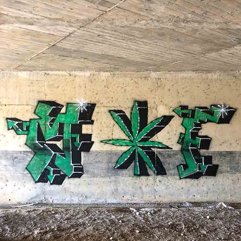
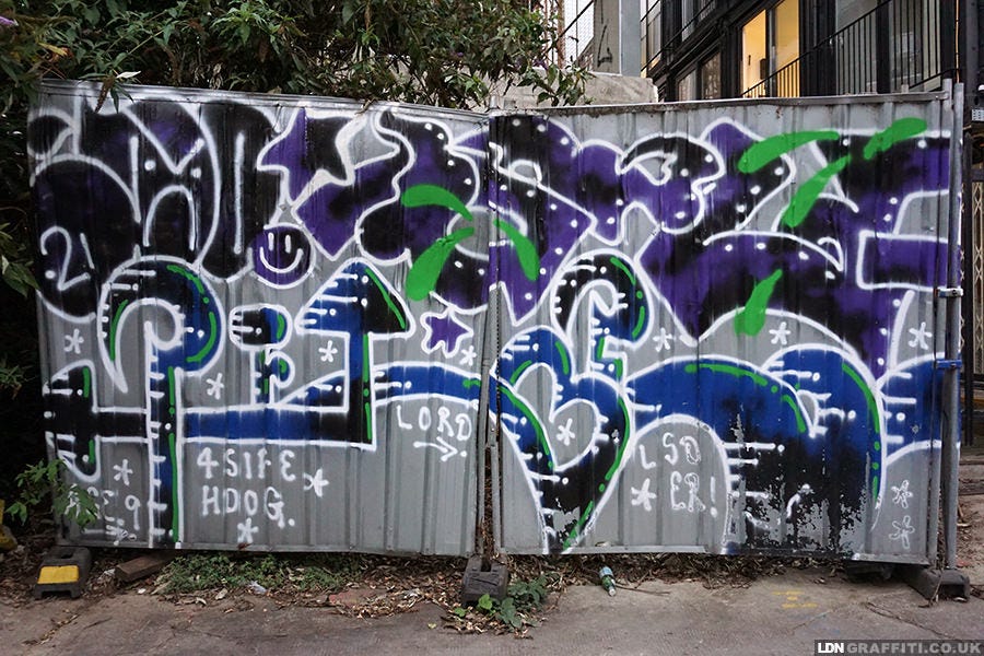
Our graffiti styles are as unique as our handwriting, usually falling within sub-styles, similar to tattoo artists working in realism, traditional or Japanese style. Proliferated by French artist Fuzi in the 2010’s, ignorant style has stylistic and methodological differences to common graffiti-art.
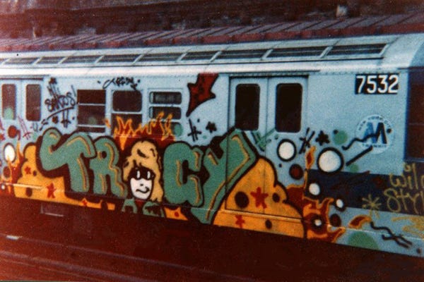
Ignorant style has its roots in the early experimental graffiti that appeared on trains in 1960/70’s New York before graffiti had universal style edicts. Ignorant style is a wish that graffiti had never evolved into something that would be unrecognisable to the artists back in the 60's and 70’s. It attempts to mimic those child-like first attempts at stylised lettering. We're left with over embellishment at the cost of balance, graffiti that does not try to hide its desperation to be cool behind a tempered and aloof style. The pioneers that painted the pre-style pieces were literally children, is it any surprise they said ‘more cartoon flames!’ instead of ‘more cohesion’? As countless regional variations brought new techniques and style continues its journey, ignorant style reaches back to graffiti art’s roots in an attempt to subvert the never ending refinement of traditional methods.
Modern Ignorant style graffiti by Peps
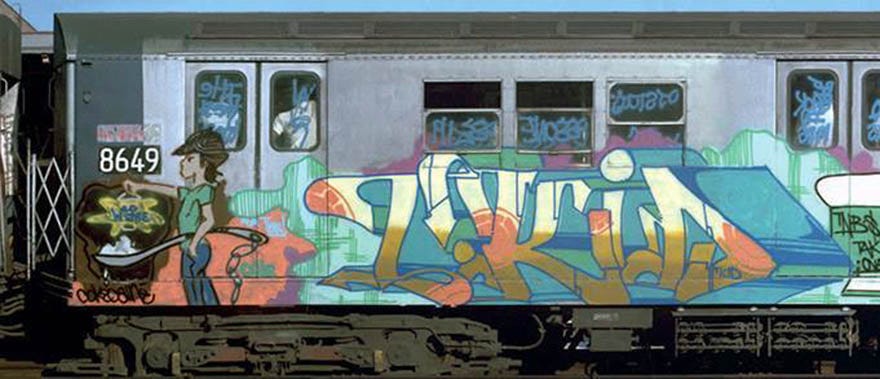
The first style to solidify itself in the late 70's was New York style, known for its neat and balanced kineticism. With it came vocabulary to describe these novel types of graffiti. ‘Piece’ from masterpiece is any graffiti that has had significant time and effort put into it, usually with 3D, shading, anything that takes planning or preparation. A ‘tag’ is something that can be done instinctively. Usually a single line and single colour, its the lowest denomination of graffiti, the fastest way of writing your alias. NY style is about being well rounded, disciplined, and of course impressively stylish. This goes for the execution of simple straight lettered pieces and tags into the camouflaged and overlapping letters of a ‘wildstyle’ piece. These aesthetic parameters are set out, but also the methods to cultivate and execute New York style, which have been passed down and largely prevail today.
A Classic New York Style piece by T-Kid, with blue tags on the windows
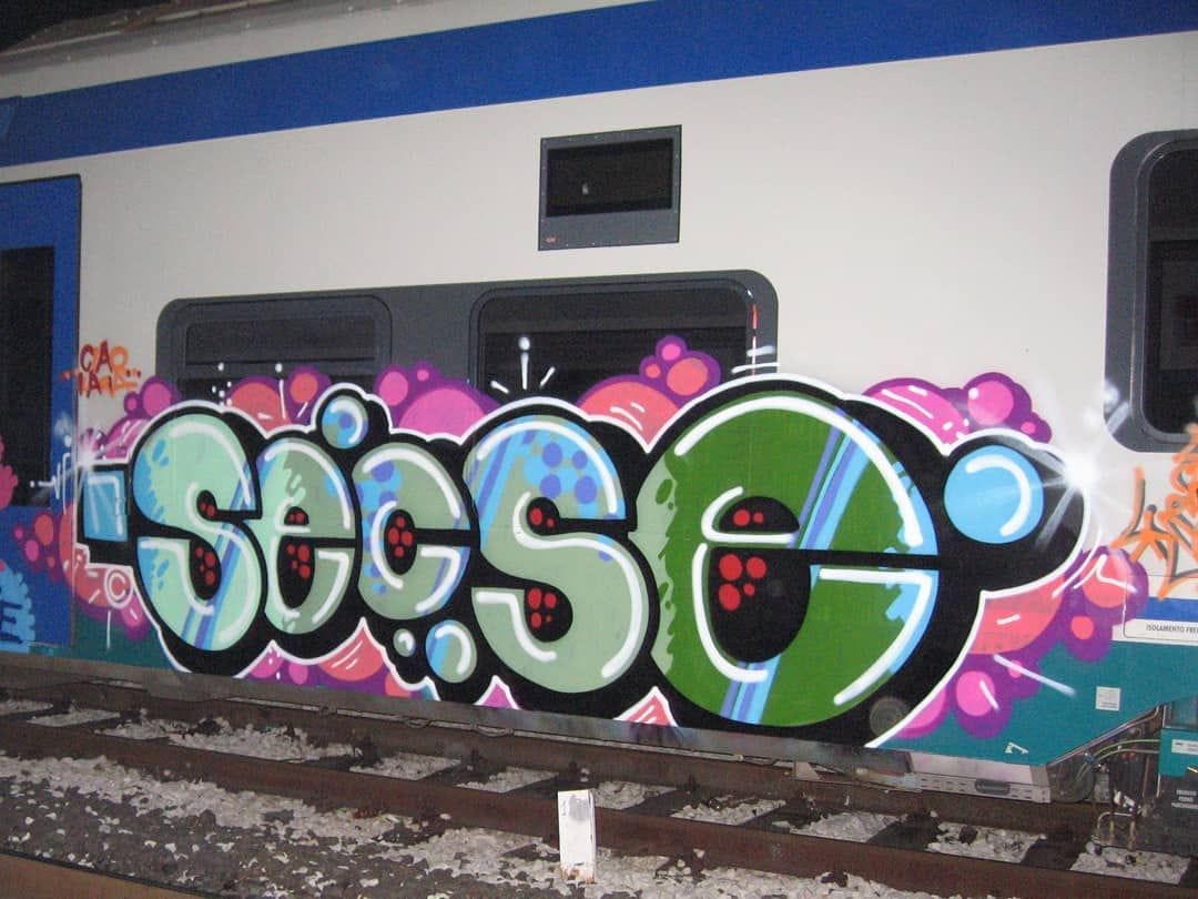
One of the first graffiti styles to continue the evolution was Euro style arriving in the early 2000’s. Forged in the high security train yards of Europe. Gone were the days where you could bring a boombox and beers to the train yard. Paintings needed to be done in minutes, not hours. Paintings were done with efficient tools, high pressure cans designed specifically for fast paced graffiti. Euro style opened the door to the breaking of conventions, taking some parts of graffiti culture but leaving others. For example: The rounded bubble lettering that was before only part of a graffiti writer’s repertoire, done when time was tight, became the sole focus. Always seeking the same balance between style and speed, but on much smaller time scales. With the help of new techniques and tools graffiti lettering was boiled down to its essence. Then rebuilt and complexity added, or even still more taken away. Euro style was the necessary groundwork for exploring what graffiti could be, experimenting and contravening conventions outside of the rigorous and hierarchical NY school of graffiti. We have also seen graffiti detach itself more cleanly from hip-hop, establishing itself on its merit or with other like minded cultures like the skaters, squatters and punks. Graffiti has since started to look very different, as the cultural practises behind the art informed new ideas and directions.
Euro style by Secse
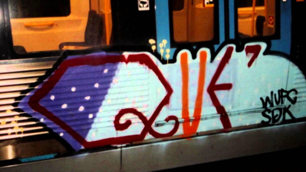
Euro style tends to be simpler; fewer colours and effects. The letters tend to be less camouflaged, if they are it is their simplicity or abstraction that courts legibility. The definition of euro style was much clearer before the prevalence of the internet. Styles tended to be region specific, even down to cities and towns rather than countries. Someone's style could vary piece by piece, their influences drawn from either side of the world. One of the most fundamental differences is the process, culture and history each artist brings with their creations, which is now no longer tied to the place we live.
Stripped back Euro Style by Que
Out of euro style, evolved Ignorant style. In some ways ignorant style is truer to the original notions of graffiti than what we have today. This is graffiti created for the individual, for the writers. In feigned ignorance of stylistic and often social conventions of modern graffiti-art. Ignorant style pushes back against the beauty of modern graffiti, correlating it to the recent mass acceptance and commodification. When the early pieces were done, they were as stylish and beautiful as any at the time. The writers in the 1970’s weren’t subverting conventions, the conventions didn’t exist yet. What’s clear is that graffiti writers have arrived at an evolving consensus of what is stylish. It’s clear that public perception, in swaying graffiti writers to paint more palatable work, leaves an increased space for a revolt against these new norms. The further graffiti-art moves from its roots, a counter-culture neatly packaged as an element of hip-hop, the more we see iterations associated with different cultures. The challenging part even for graffiti artists, is just how far removed graffiti has become from its origins. Ignorant style is graffiti writers taking a stance against all of the new information we have coded into modern day graffiti.
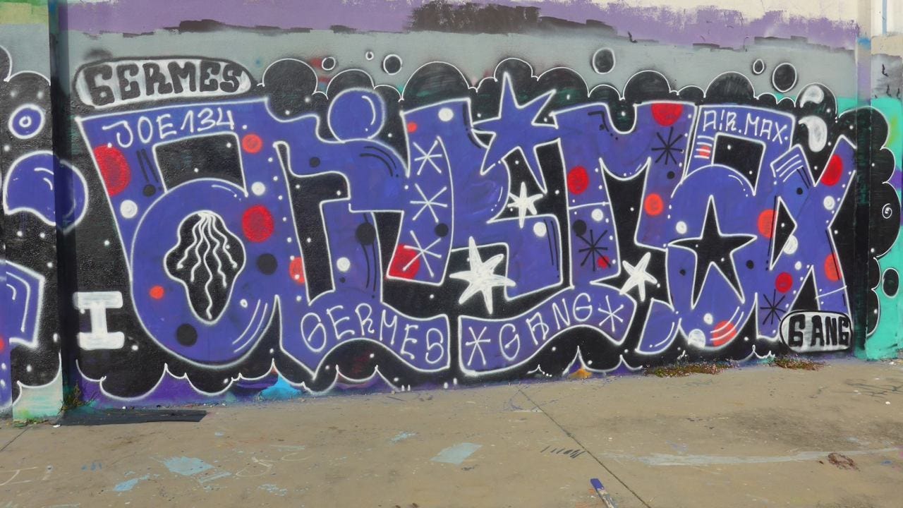
Ignorant style graffiti that says ‘Airmax’
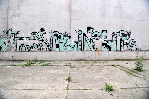
Signifiers of style: Demonstrations of mastery, balance, flow or use of space. These can be eschewed by ignorant style writers in favour of a purposely ugly letter style. Conventions are explored without the goal of achieving a stylistic equilibrium. Over time stylistic traits have formed into recurrent objects in graffiti pieces, the best example being the arrow. A signifier of movement and flow, the arrow has been used continuously from graffiti-arts inception to current day. Instead of arrows signifying cohesive movement, ascribing flow between the letters, they are blunt and pointed in contrasting directions. Drips and untidy line work is purposefully introduced, often using spray paints closer to what was available in the 1970’s compared to the paint designed specifically for artists available now. It’s graffiti making fun of itself: If arrows are cool, why not just put them everywhere? This approach to creating graffiti-art in the oh-so-cool graffiti world, goes hand in hand with tattooing. What could be funnier than getting something stupid tattooed for life? I was drawn to learn more about the style through tattooing, mostly because the rhetoric around ignorant style from graffiti writers made it impossible to discuss on the internet. Clearly the style had already succeeded in its goal, people hate it and Americans don't understand it.
Anti-Style Graffiti by Feebl that says ‘Feline’
Ignorant style is hugely popular in tattooing. There are parallels to the gatekeeping and apprenticeships of the tattoo world and the graffiti scene in New York. The internet has taken the place of the mentor, passing down information and providing access to resources, whether that’s tattoo machines or spray paint. As part of my research I decided to get in touch with an ignorant style tattoo artist I had been following on Instagram for a while, Ella @stinkypinkypokes.
I met Ella’s family when her sisters attended a workshop of mine. Her mam spoke proudly about her daughter who’s into art, to which I asked if she had an art page online.
‘She does, but she posts other stuff too, naughty things!’
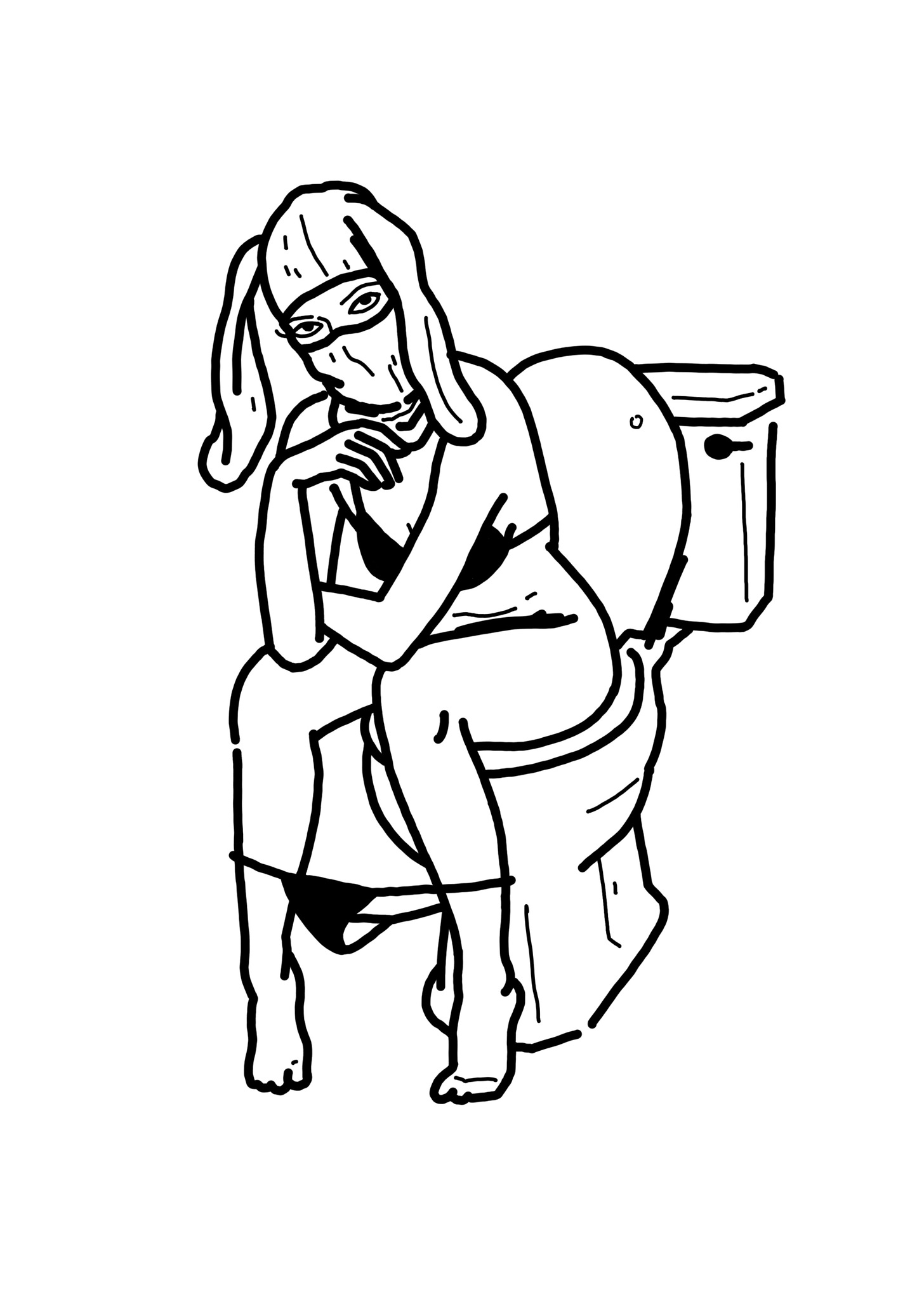
I can’t remember which picture came up first when I looked at her Instagram, but it would be something like her sitting on the toilet in a balaclava, for example. I was keen to get an understanding of how working with ignorant style has influenced her creatively, and how constrained she felt creating within its paradigm. Ella seemed to, at least online, embody ignorant style. Her designs reflect this and are often crude in both senses of the word, yet clever and charming. We spoke over the phone and arranged a collaboration, she would tattoo me, while I interviewed her. In discussing designs, which would be graffiti related, I had to introduce a caveat due to one of her recurring themes: ‘No dildos’.
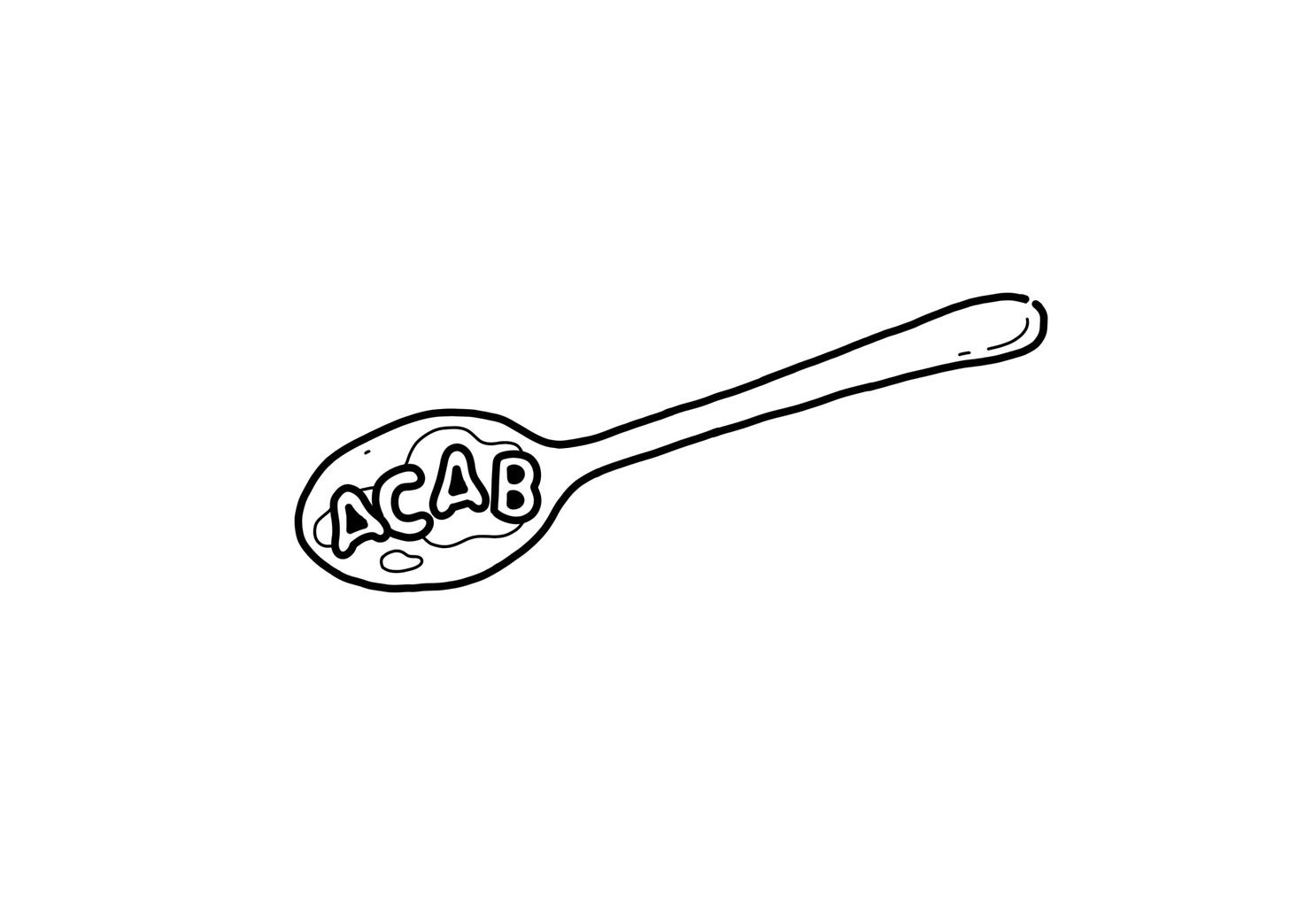
Tattoo design by Ella
The seriousness of painting illegal graffiti is mirrored in the permanence of tattooing. There is a shared joy among the ignorant stylers to paint something that not only breaks stylistic conventions, but challenges the perceptions of people who ‘know’ what is and isn't ‘proper art’ in their scenes.
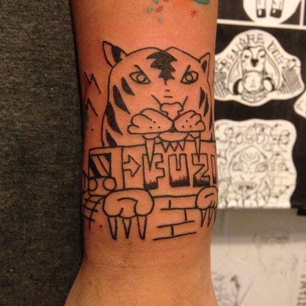
Fuzi created ignorant style while teaching himself to tattoo. Instead of seeking apprenticeships and being hazed by grumpy tattoo artists in well established shops, he would bring his tattoo machine into train yards and tattoo his friends. The more I learned about Ella, the more it seemed that typifying her style was a huge disservice to what was a natural and self directed arrival into the bracket of ignorant style. Fuzi, or just his style that went out into the world beyond him, empowered people to use non-standard frameworks to establish themselves as artists. Ignorant style is more about the methods and the meaning behind the art. Which is why I think people some find it so difficult to enjoy.
Tattoo by Fuzi
Graffiti writers should remember that ignorant style graffiti and that of a New York style artist may not look that much different to someone who is struggling to empathise with either party. For me, in the writing of this article and the book that will eventually amalgamate it, graffiti is always about who the artist is, what motivates them and what their practise is. I find truer art in the way someone like Ella demonstrates her abilities with single colour, simple designs, as opposed to someone who can perfectly replicate a picture onto skin. I’m not looking for anything other than an artist tapping into their own well of creativity, producing something that is both new to them and instantly recognisable as part of them. That’s why ignorant style doesn’t have to look good to be good. In the graffiti world, this focus on process over product is at odds with graffiti’s commercialisation.
If stylising a letter for the enjoyment and recognition of the layman is one end of the spectrum, completely breaking down a letter to the point it’s barely even recognisable, and at times only even representing a letter is the other end. I find the most joy in the extreme ignorant style that is merely influenced by the movements and shapes that make up letters without being constrained by legibility. In a lot of ways ignorant style is a huge step towards the distillation of graffiti into its true fundamentals; physical movement and the shapes that it creates, transposed onto wall space. It makes a valiant attempt for purity of marking the surface, the destructive and creative essence of graffiti’s counter cultural roots.
Tattoo design by Ella
The process continues to contribute to the overall feel of the work. Ella hand pokes her tattoos, rather than use the electric machines. The buzzing which is synonymous with tattoo shops is not present at all in the shop we were in, only hand poke artists work there. It makes the whole process much more relaxing. Though I was put on edge as soon as I smelled the distinctive watered down bleach, remembering my first tattoo just after my 16th birthday. In an attempt to not get ID’d, I’d chosen a shop that looked relatively dodgy and was up a flight of stairs away from the road. I’d also brought my mam.
‘Have you done one of these before?’
‘What!? A tattoo?’
‘Nah a haircat.’
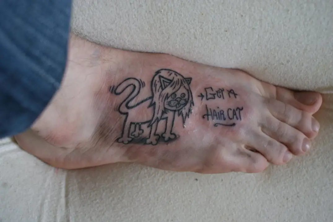
My nervous joke thudded to the floor in the silence that filled the air. I was getting a cat with a head of long surfer hair, with the words ‘Get a haircat’ next to it. If this guy was going to illegally tattoo children he wasn't going to listen to their shit while doing it. After an hour of staring down at this gargantuan man's mohawk follicles as he silently tattooed me, I paid him £75 and was pleased with my tattoo.
I had found the design on Flickr, a photography website where graffiti writers congregated in the early 2010’s. One writer had uploaded pages of his sketch book, one of many hundreds of designs, I printed it out and took it to the tattoo shop. Only telling the artist, who I didn't know and had never interacted with, after it was done. Apart from being sensationally weird, which is what 16 year old me was going for, it just commits several breaches of basic inter-art decorum. It was, in the typical sense of the word: Ignorant.
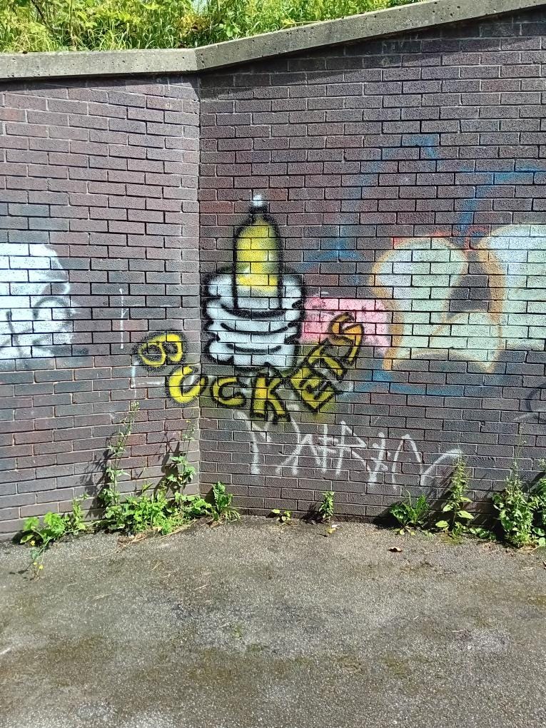
Ella designed my tattoo based on something that I found painted in an underpass in Peterlee. Misshapen letters filled in with yellow, mirroring the smoke pictured within the bottle-bong affectionately known as a ‘bucket’ in the North. The top half of a bottle has a dot of grey indicating a chillum in the hole, below it the same grey is used to depict a container filled with water, which the bottle emerges from when lit creating what is effectively a gravity bong.
This painting was done not by a practitioner of graffiti, but by someone accidentally achieving the aesthetic traits of ignorant style, as well as the methodological and interpretive ones. It's irreverent, simple, not perfect or cleanly painted but it just has so much charm. This is the innocent mural making that ignorant artists wish they could replicate. Every child is an artist, as Picasso says, the problem is to remain an artist once we grow up.
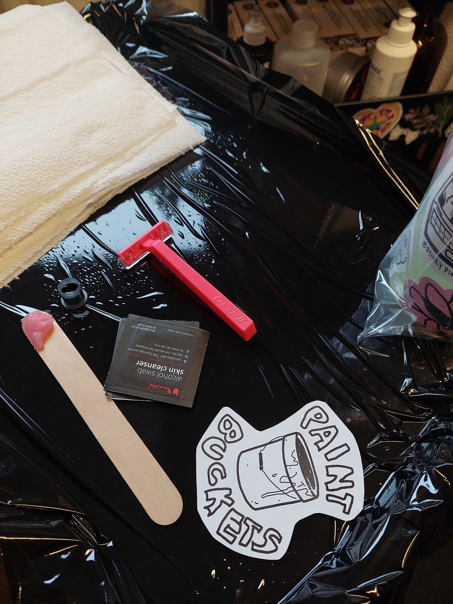
Sadly this painting, which is an elaborate homage to drug taking, was clearly made by a child. As much as I love the design, as someone whose singular regret is that I did all my drugs under the age of 18, I can't promote smoking weed. Instead, Ella reworked the design to say ‘PAINT BUCKETS’ with a small spill down the side of the used paint tub.
Perhaps ignorant style is what graffiti looks like on another timeline where it stayed its course and flourished at its own pace. The push and pull of public perception, vilified and made synonymous with youth rebellion to the point that it’s an excellent marketing tool. As much as ignorant stylers try to pry graffiti back from the hands of popular culture, there are parts of the graffiti fraternity that are overjoyed to find acceptance. There has always been an element of pandering in graffiti, whether that’s to mystify, inspire or annoy. The public and the media play a huge role in how we think of and practise graffiti.
Mural from graffiti writer Does
Ignorant style takes a truer stance with the sample culture of hip hop, remixing graffiti-art in a way that reimagines its purpose in the modern era. I’m sure as the funk players strummed a ten second bass riff, they had no idea it would be snipped out of their song, looped, then top charts with someone rapping over it. Perhaps they feel the same as graffiti writers often do towards ignorant stylers. The thing they created has been re-used and perverted in a way that is almost insulting to its original form. If you are able to distill an entire song into a perfect 5 second riff, is convention all that’s stopping you?
So how do we differentiate good ignorant style graffiti from bad graffiti? Can’t bad graffiti just be called ignorant style?
The good ignorant style graffiti is created by experienced practitioners of graffiti art who have an in-depth understanding of the conventions in order to subvert them. Can an artist who has the inability to produce neat steady lines create a conversation with their piece when they ask, what if I didn’t create ‘good’ lines? There is still the process of trying to get good, even if you’re trying to look ‘bad’. It's the meaning and the methods behind the work, obscured purposely in this case, that makes ignorant style so purposely unpalatable.
Ignorant style graffiti by Germes Gang
With its huge successes in liberating some artists and annoying others, ignorant style has matured to form its own practises and tropes. The same swooping bars that elegantly connect letters together in a New York piece, lead to nowhere, achieving the opposite of bolstering a piece’s flow. It’s in this way that a knowledge of both the normative graffiti styles and ignorant style’s irreverent tropes are vital in the creation and the identification of ignorant style. It’s considered creation of graffiti that entertains peers and scares the public.
Ignorant style graffiti by Feebl and Doom
The realisation that you’re creating something from a formula set over 50 years ago has pushed the rebellious spirit of graffiti writers to re-interpret what their art means to them and what they want to see. As such it’s no wonder that ignorant style graffiti has arrived. It was heralded in just as graffiti was commodified and picked up as a marketing tool, often being delivered alongside a shudder cringe with words like ‘urban’. Ignorant style represents graffiti taking a step back towards its roots, snubbing convention and telling the world:
‘We will make you hate graffiti again, you’re going to love it.’


